If you usually spend a lot of time building tables and charts for sustainability reports, carbon footprint calculations, or internal analysis, this update will make your workflow much easier.
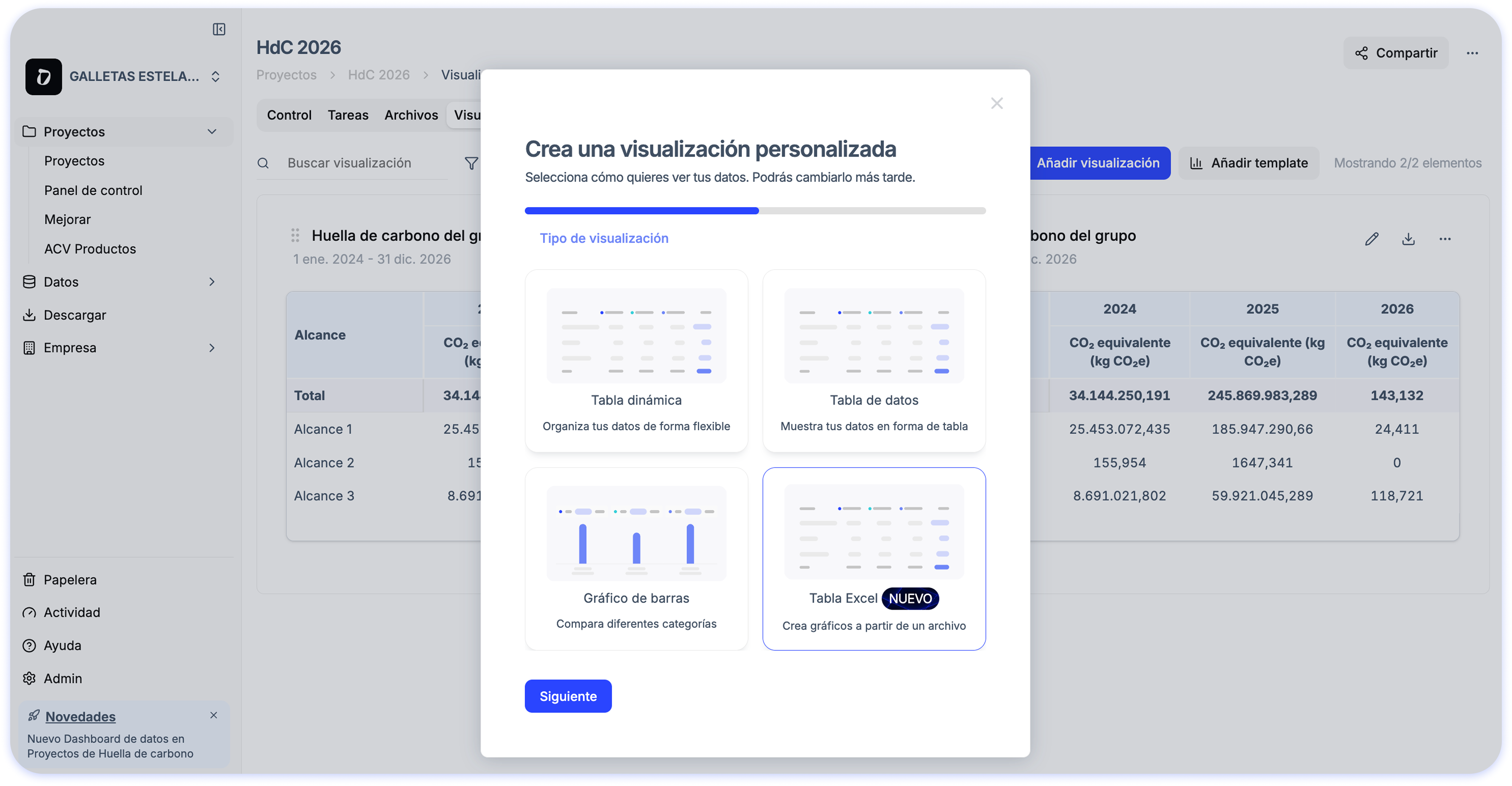
📊 Automatic visualizations from Excel
When you upload your Excel file, Dcycle generates ready-to-use visualizations so you can:
- See your data automatically updated after processing
- Avoid complex manual configurations
- Analyze results with flexibility and detail before reporting
✨ How does it work?
Simply upload your Excel file from the Visualizations section and Dcycle will automatically create the charts. You can then adjust, customize, or create new visualizations based on your needs.