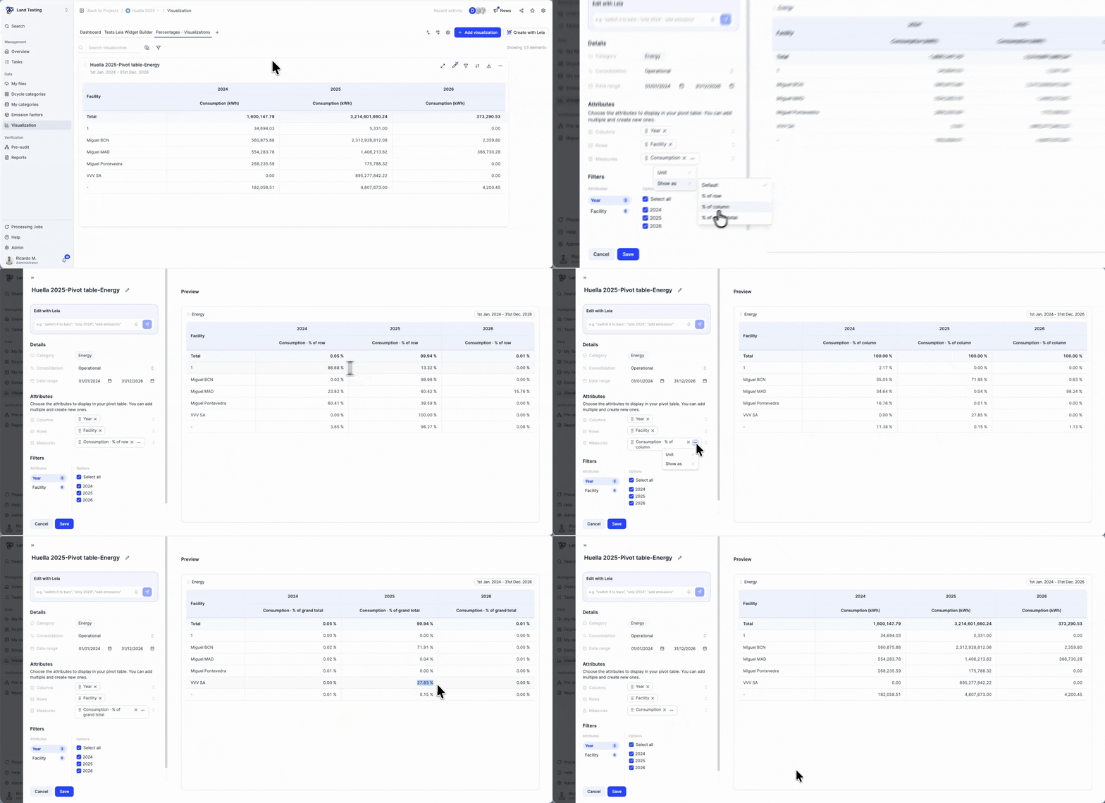
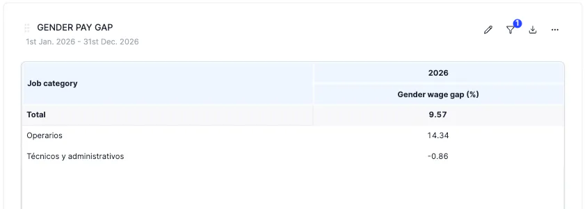
You can now analyse employee remuneration and gender salary gaps directly in the pivot table dashboard.
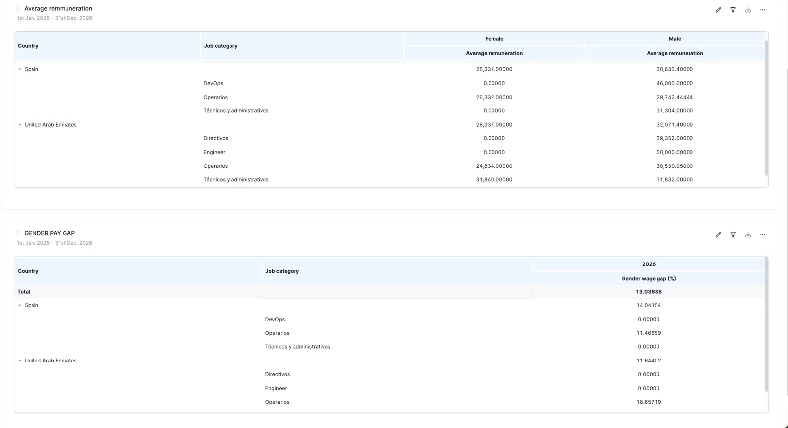
What changed?
- New pivot table category: Remuneration & Wage Gap, available under Social categories for all organizations
- Three measures available:
- Five hierarchies: Company, Year, Country, Gender, Job Category
- Fiscal year support, toggle between natural year and fiscal year grouping (if your organization has a non-January fiscal year start)
- Financial consolidation, all three measures support operational and financial (participation-weighted) views
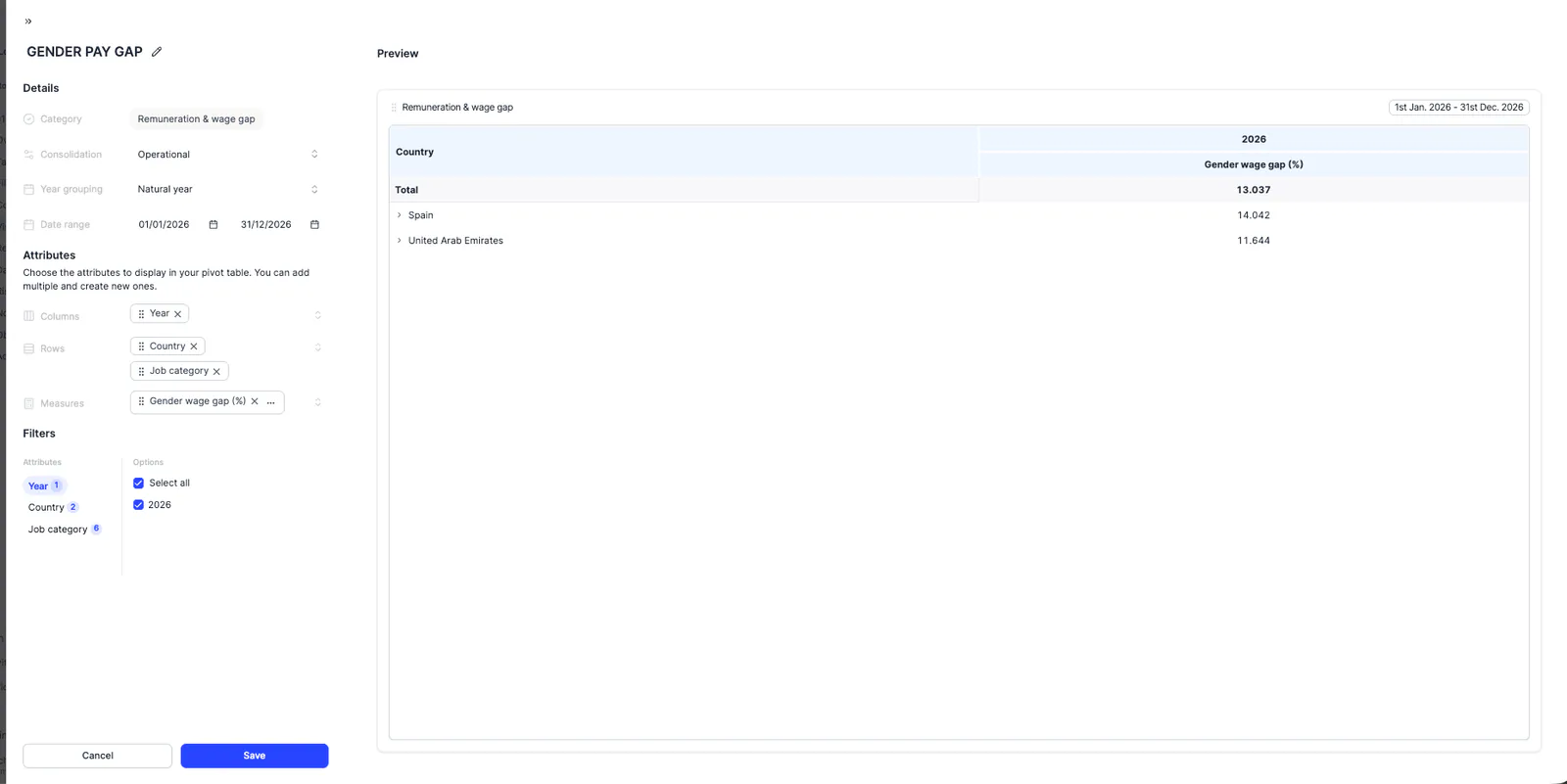
How does the wage gap calculation work?
Unlike simple averages, the wage gap is computed from the underlying employee data at every level. This means parent-level totals (e.g. by country or company) reflect the true weighted gap, considering the number of employees (FTEs) per group, not an average of the averages shown in the table.
Pro tip:
Create a custom row or column attribute to define age groups and build your table to your liking.